Matching your roof colour to your exterior walls
Roof is the crowning glory of a building, yet most overlooked at times. How much thought is actually put in to selecting the right roofing? The traditional terracotta tiles and metal sheets are not the only ones available in the market anymore. With a variety of different materials from both domestic and international market available, the designers can now let their ideas go wild with roofing and give the building the appeal it actually deserves. Having said this, let us discuss how we can match the exterior wall to the roof colour to give it the WOW look.
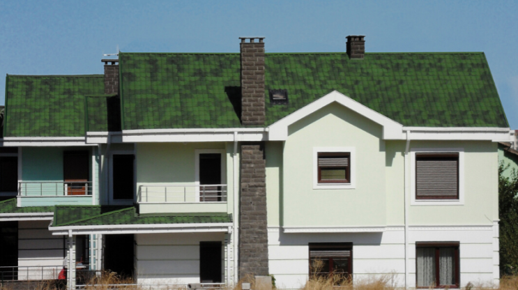
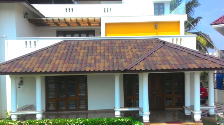
White Walls
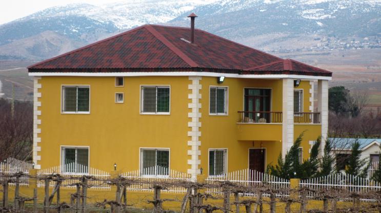
White paint is a classic choice when it comes to exteriors, providing a clean and fresh look. More importantly it creates an exceptional backdrop for contrasting architectural details. But we must remember that there are various shades of white to choose from. There are so many options in undertones, finishes, and tones, like Ivory, Brilliant white, Linen white, Cloud white to name a few and each one has a different impact. Now because the exterior is primarily white, that gives you an opportunity to play with really bright and bold colours for your roof. You can go for a black roof which is very classy or bright hues of red, green or brown.
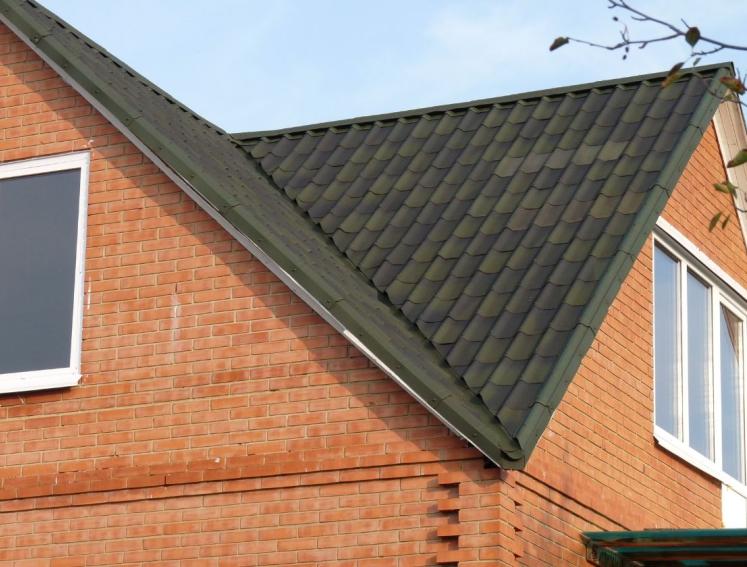
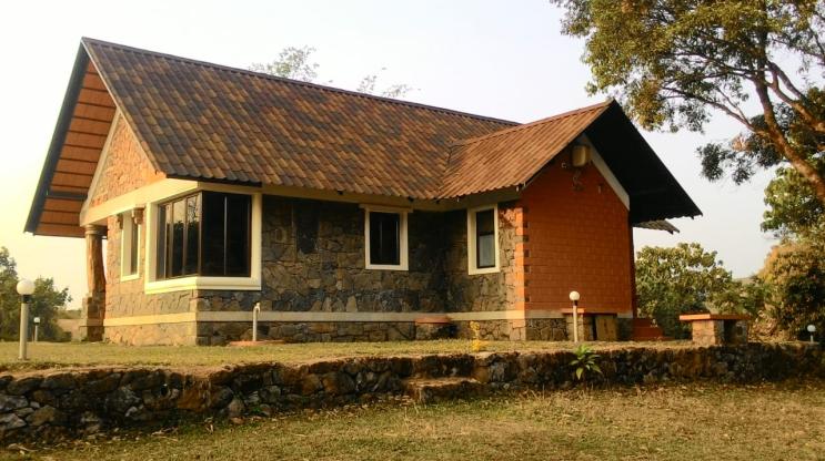
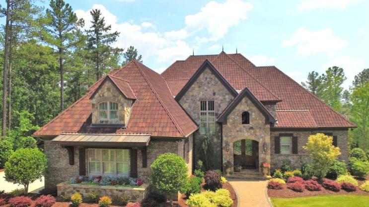
Stone Walls
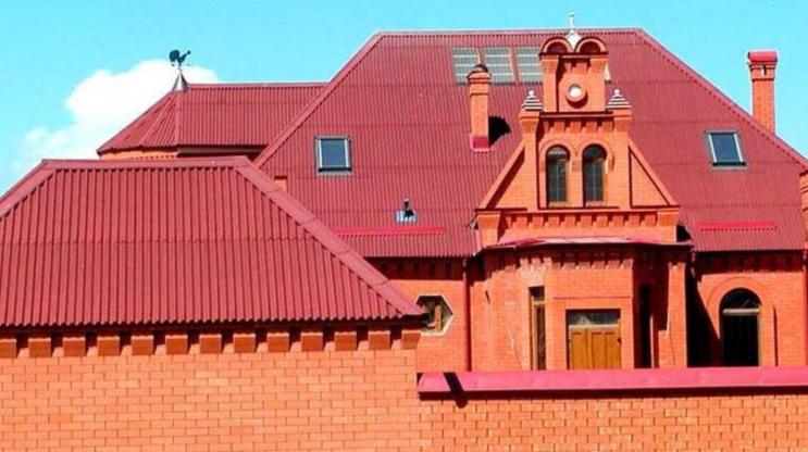
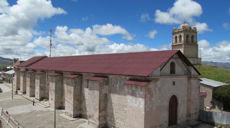
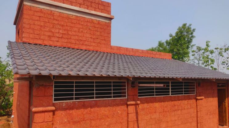
Stone or brick walls are coming back in trend. Especially because the red brick walls tends to give a very earthy eco friendly appeal to your building. If you are using the red brick with an orange tone, a roof in a classic grey or even darker red looks really good. You might not think of red to pair up with your brick walls but, the secret to a successful red-on-red play is sticking with a primary, basic shade of the color. You can add pops of blue, sage green, mint, or turquoise to doors and windows to give the building an outstanding look. If the stone wall has medium tan hue consider using a green shade for your roof. If you have a light brown or beige style of brick, try using dark brown. If you choose to go with raw granite as the stone for your facade, you can choose earth-tone like terracotta, or our range of shaded brown tiles.,
GO BOLD AND USE CONTRASTING COLOURS
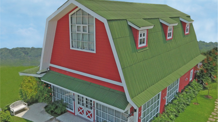
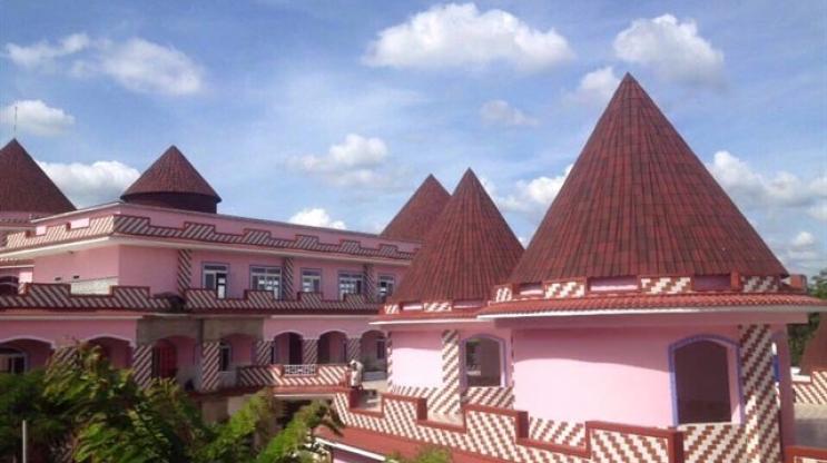
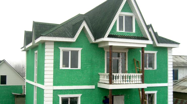
If you are the ones who doesn't like to play safe, we recommend using bold contrasting colour palettes. It is said that black and white is going to be huge in 2020. Well that combination is everlasting and will never go out of trend. When you decide to go bold you have to think of colours that otherwise don't work like pink and red, it can work . The important thing to get right is the balance of tones; like the Hello Kitty School in Vietnam (shown in the gallery below) have used pink with our shaded red tiles. Red and pink are also a monochromatic color scheme which makes for a complementary palette. In 2017, the Pantone Color of the Year was called Greenery. This year’s trending color combination shows how green has matured into something more edgy and dark. You can see in the images below how our shaded green tiles fit well with the green walls of the building. If you really want to go bold with your colours try using red and black. It is one of the most voted colour schemes for 2020. Stand out from the crowd with a Bright Red and Yellow color scheme. The color combination of red and yellow is extremely captivating. Coming back to red, combine it with green and you have a contrasting as well as one of the classic color combinations.
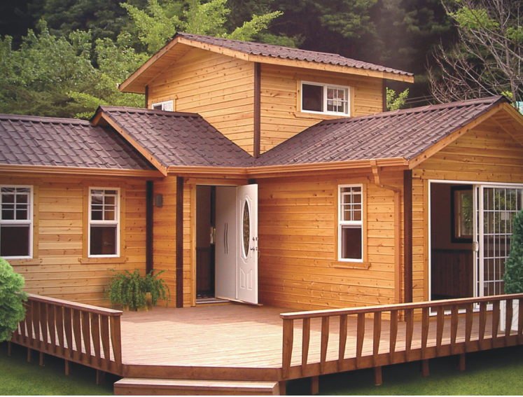
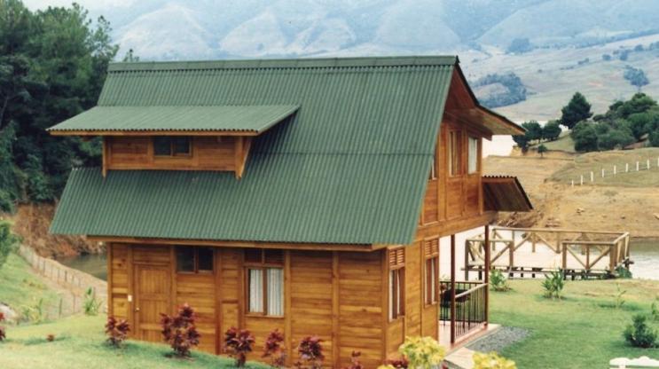
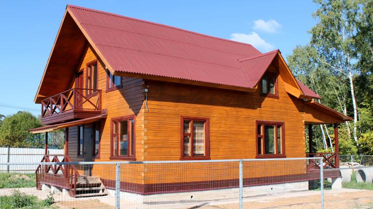
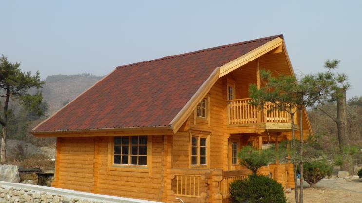
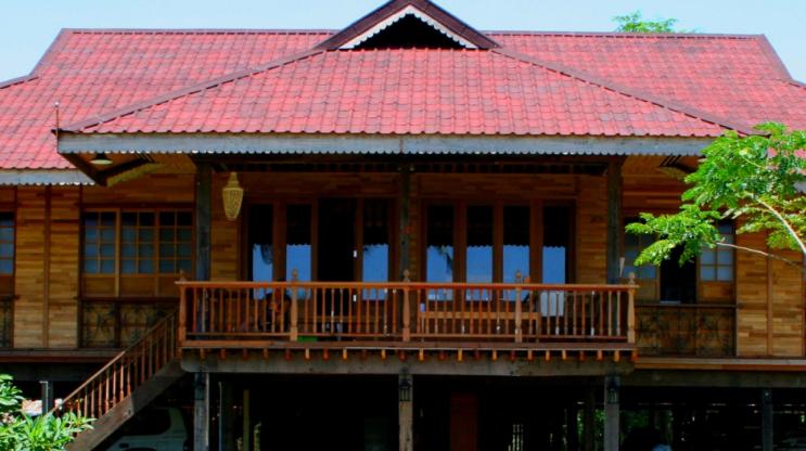
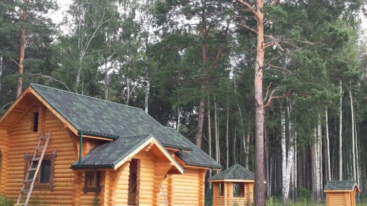
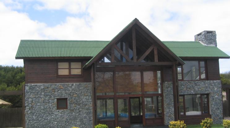
WOODEN HOUSE
Though vastly popular in Russia and Europe, wooden houses are slowly gaining attention in hospitality sector in India and some people are even considering leisure homes of this kind. Onduline is one of the most sought after roofing for wooden houses in India by manufacturers but we are here to discuss which colour will match the log homes. Our favourite pick with wooden homes would be green for the obvious reasons. The olive-toned greens are the best but shades of brown, grey and red are also excellent choices. Why we do not recommend terracotta is because it is so similar in tone that the wood is nearly lost.